
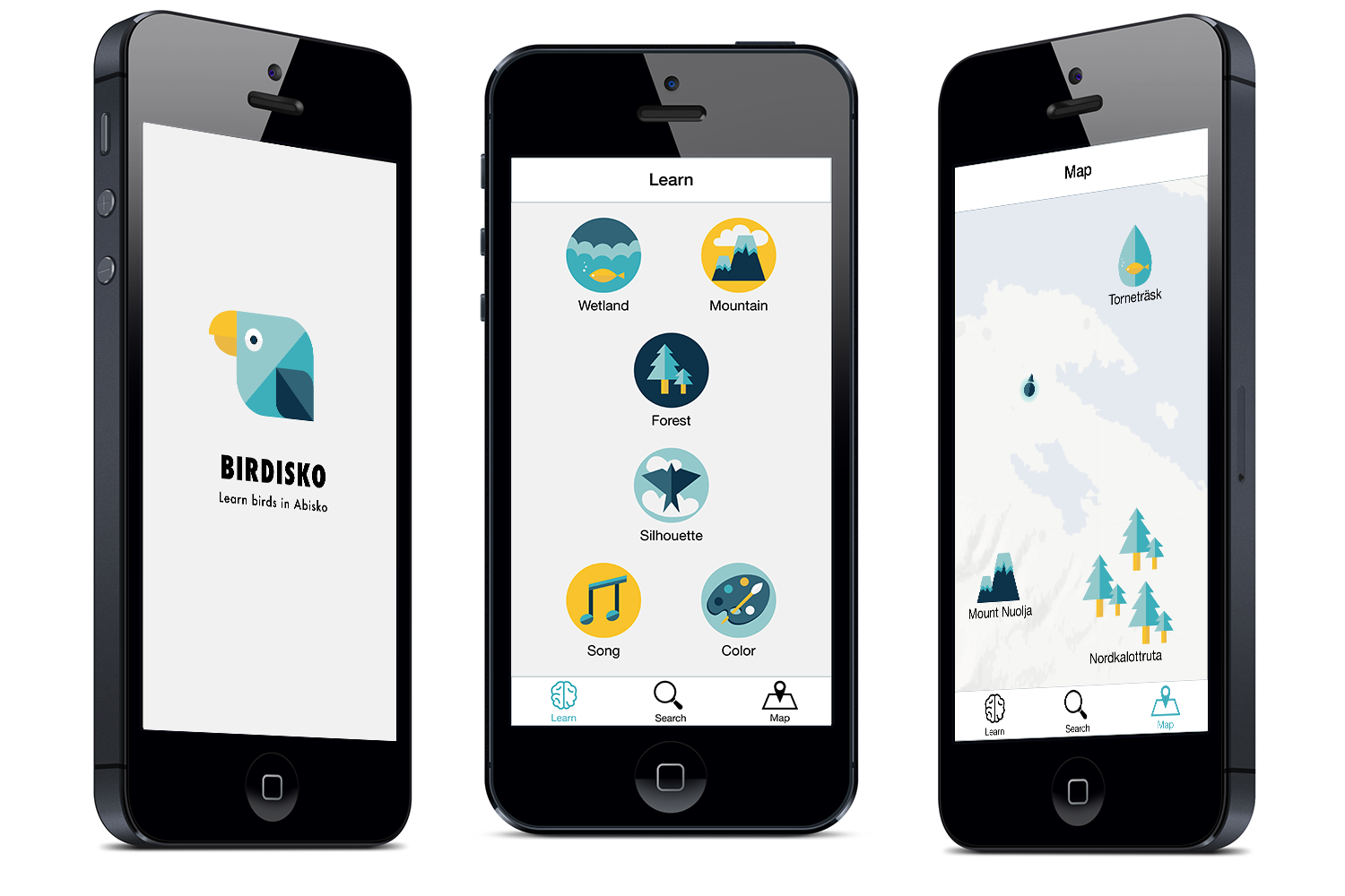
Birdisko - Graphic interface and prototype
<Birdisko> is a mobile app for novices to pick up birdwatching in Abisko, a national park in north part of Sweden. Users will go through a set of tasks in order to learn and improve their skills of bird identification in the wilderness.
Skill: Mobile interface | Prototype & Coding | Ethnographic research
Duration: 3 weeks of communication design project
Time: 2014 spring
Brand elements

Quiz flow sample: wind shape
Prototype in Proto.io

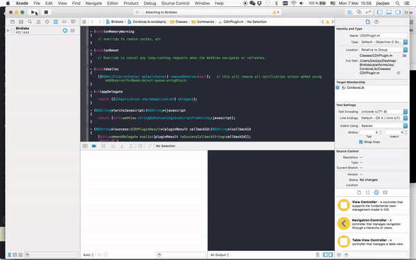
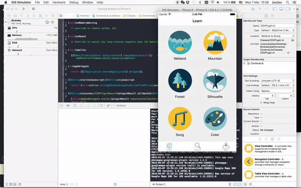
Project onwards: Cordova and prototype in iOS
Micro-interaction #1: tab selection and map
Micro-interaction #2: lesson selection
Personal reflection
I extended the interface to prototype afterwards to learn and try out prototyping tools in different fidelity: from click through animation prototype to Cordova. For me making something real is crucial for a deeper understanding of interaction patterns. I believe excellent design doesn't only stay in a concept level. The only way to prove an experience is to experience it in real. As interaction designers we should be able to pick up the skills to deal with "raw materials" in a short time, be it coding, electronics or even biology.
Design learnings
- Timeframe issue: if time is limited, it is better to combine an overview of interaction flow chart with several signature flows in detail
- The advantage of digital platform is to sort multiple layers of information in a logical way. Graphics shouldn't be as detailed as ones in print media since simple graphics are more adaptive to multiple screens.
- The usage of standard UI element helps users to have to cohesive understanding
- The language used for game should provide the information encourages user to learn. After the quiz, it is important to provide the chance to reinforce memory.
- Design a coherent gesture language for the same category of information
Things I would have done differently
User test paper prototype might be leading. Try out real screen interaction even if in a sketchy level
- Focus on a few key features at an earlier stage to develop
- Error page: what if user gives the wrong answer (and this is only due to limited time)
Design opportunity: lack of activities for visitors to participate in birdwatching

Facts of birds in Abisko
- Birds migration in summer
- 231 species defined in the area
- Geographical diversity for birds habitant (mountains, open field, lakes, forests and shrubs)
Summer tourists in Abisko
- Lack of approaches (e.g. guided field trip)
- Not easy for beginners topic up themselves
- Summer tourists are generally interested in nature (midnight sun, hiking)
Design challenge: spark interest and enhance memory in birdwatching learning process
Existing solutions
Information Architecture of Collins birds guide
Information Architecture of iBird, a bird search engine
Ideal solutions:
provide information in sequence
Information flow of bird identification manually: from general to detail
Information flow of bird identification manually: the dominant feature that leads to the only conclusion
Design direction:
learning experience v.s. knowledge
Three models of Information flowchart of bird identification
1. How to cut down information in a comprehensible and intriguing way for novices to pick up birdwatching?
2. What is the most appropriate solution to achieve this? What is the content? What is the medium?
I kicked off the project by comparing information flow charts of bird identification in different medium. As for Collins birds guide, information is not clustered. Thus novices usually find it hard to follow even it has the most delicate bird illustration. iBird allows users to search birds based on a variety of principles. This elevates the efficiency of bird identification on the go since birds hardly stay for a long time. However, the disadvantage of this solution is that novices might heavily rely on technology instead of developing their own skill and knowledge of birds.
Then I had two interviews with birdwatchers in order to discover the real experience of birdwatching and the motivation behind.
One of the interviewee pointed out "The identification of bird is similar to how you recognise your friend. You recognise your friend by his overall appearance, not his eyebrow colour." And being able to identify a bird by yourself is one satisfying fulfilment, sometimes even attributes to one memorable experience.
To conclude, I mapped out these information architecture based on an axis of experience and efficiency. The left side of the diagram indicates an education system by "asking the right question at the right time", which enhances one's sense of achievement and memory afterwards. This serves as the essence of birdwatching rather than a birdpedia.
Design solution: A mobile app that introduces the sequence of bird identification
Information flow chart
Interface flow chart
Graphic interface focus area
To cope with the multiple layers of information and the need of bird identification on the go, an mobile app was introduced as the final solution. Information flow was used as a skill to capture the overview of the app and later to decide on the focus area of interface design.
In the identification learning section, a quiz system was implemented for an engaging and fun experience, while the bird search engine still allows user to choose their own filter to be efficient of identification on the go.
Three categories of identification process are illustrated in the focus area chart, namely: silhouette & shape, song and colour, which are sufficient basic technics for bird identification.
Design process:
Insights from ethnographic research - Rebrief - Interview and Research - Design insights - Information flow chart - Wireframe - Key features development - User test - Final deliverable
From information to wireframe
Interface brainstorm main page
Interface brainstorm quiz detail
Interface brainstorm quiz detail
Wireframe structure
User test interaction patterns
Graphic interface
Focus area wireframe
Wireframe test kits

User test documentation video